
What is a dashboard?
Simply put, a dashboard is a highly visual display of data that is a useful tool in keeping businesses on track to achieving their goals and objectives. It provides a centralised, at-a-glance view of the most important information, allowing teams to get a better understanding of their performance and identify changes, both positive and negative, in real-time.
Dashboards are used to track KPIs and metrics and are automatically populated using various data sources and channels. Even if you have not used a dashboard in business, it’s likely that you’ve used one before, whether it’s your car dashboard or your fitness tracker.
Benefits of dashboards
Dashboards are a great way to collate your data for a multitude of reasons. Here is a list, though not exhaustive, that will help you see why dashboards can be a key tool for your team.
How dashboards are used in reporting
So by now, it should be evident that dashboards are great tools to help organisations take better advantage of the vast amounts of important data and information at their disposal. Using dashboards in the creation of your reports is a wise decision for many reasons, the main one being that you will mitigate the risk of including any incorrect data in your reports.
Automated dashboards present data exactly as it appears in the original source, meaning there is no chance of any mistyped numbers or typos in your reports. This in itself, helps to provide accurate, transparent and reliable data, not to mention saves you valuable time.
Source: Forbes
We won’t discuss all the benefits of using dashboards again (as we’ve just discussed them in-depth above), but whichever way you are using dashboards, it’s important to be aware of the main differences between dashboards and reports. While both serve the same purpose, that is to help make data-driven decisions and show progress, there are slight differences between them that we will look into further below.
What's the difference between a dashboard and a report?
It’s probably important to look at the difference between a dashboard and report when looking at how you can effectively use dashboards in your reporting cycle. Reports are static documents, featuring historical data from a specific point in time. They will sometimes use visuals to highlight relevant information, but they will more than likely include a plethora of raw numbers. That’s because the purpose of a report is to provide detailed analysis of data at any given point, and will likely be used for specific purposes like monthly leadership meetings, annual reviews, etc.
Dashboards, on the other hand, are living documents. A good dashboard feeds real-time data into a platform that provides visualisations. It is meant to be a high-level overview of a curated set of KPIs and metrics that answer a specific question.
Thus, reports tend to be more detailed than dashboards, and likely much longer. They will offer the opportunity for very in-depth analysis, so require a large effort to build and share. Dashboards are built to be efficient and easy to update, and are tools for specific circumstances.
Does my business need a dashboard?
The question, then, is when do you need a dashboard? Dashboards are most appropriate when you need to provide high-level insight into a complex system, for example, to a management team or c-suite.
If the question is ‘does my business need a dashboard?’ the short answer is yes. Imagine driving a car. Would you technically be able to get to your destination without elements like a speedometer, fuel gauge, or sat nav? Yes. Does having those elements make your drive not only more efficient but safer? Also yes.

Source: Media Education Centre
Data dashboards function much in the same way. You don’t strictly need one to do your day-to-day job, but most processes will be much smoother and more efficient if you incorporate one.

Knowing you need a dashboard is only half the battle - you also need to know what type of dashboard is right for you. This is more than knowing you want to track marketing KPIs as opposed to sales data. There are four main types of dashboard that teams and companies will use, either on their own or in combination with one another.
Operational dashboards
Operational dashboards are for when you want to monitor specific processes or, as the name states, operations. One of the defining features of an operational dashboard is the shorter timeframes, tracking real-time or transactional data against your key metrics or KPIs. That’s because the objective of people using operational dashboards is to monitor what is happening right now.
Operational dashboards are designed to be integrated into your daily workflow. Think of a call centre or direct sales team - they want to see what is going on as it happens, as it will actually affect their day-to-day activity. With that in mind, operational dashboards should also contain contextual data that informs decision making.
Because of all this, operational dashboards have to have a fairly detailed view, looking at granular data that will show you progress towards a target and facilitate real-time action.
Operational dashboards help teams be proactive and get in front of any potential issues. For example, if a call centre team is using an operational dashboard, they can track things like call time, dropped calls, and complaints in real-time to ensure their SLAs stay in the green.
Example
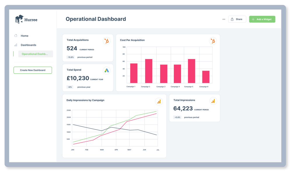
An operational dashboard, as mentioned, will show real-time performance. That looks different for different teams, but a marketing team may use it for something like paid search campaign management. This would allow you to see how a campaign is performing and address potential issues. It might include metrics such as:
- Cost per acquisition
- Number of clicks
- Click through rate
- Cost per click
- Spend across a set period of time
- Total spend
- ROI
Check out more about marketing dashboards here.
Strategic dashboards
Strategic dashboards are used when you need a high-level overview of what’s going on in the business, to identify opportunities and issues. They can sometimes be known as executive dashboards as they allow senior management and executives to monitor the status of KPIs. Whereas operational dashboards look at the day-to-day, strategic dashboards look at long-term strategies and high-level metrics. Essentially, these types of dashboards help you understand the overall health of your team or business by summarising performance over a set period of time, like weekly or monthly. The important thing to remember is that these dashboards are designed to be checked at regular intervals so you can keep on top of your performance against your chosen KPIs.
Using benchmark data, strategic dashboards are used to align the performance of departments and teams with the overall business strategy. The best strategic dashboards will aggregate data from multiple sources to ensure that all areas of performance are being tracked accurately. The type of data you’ll see on a strategic dashboard are things like KPIs, balance scorecards, sales performance figures, etc.
Example
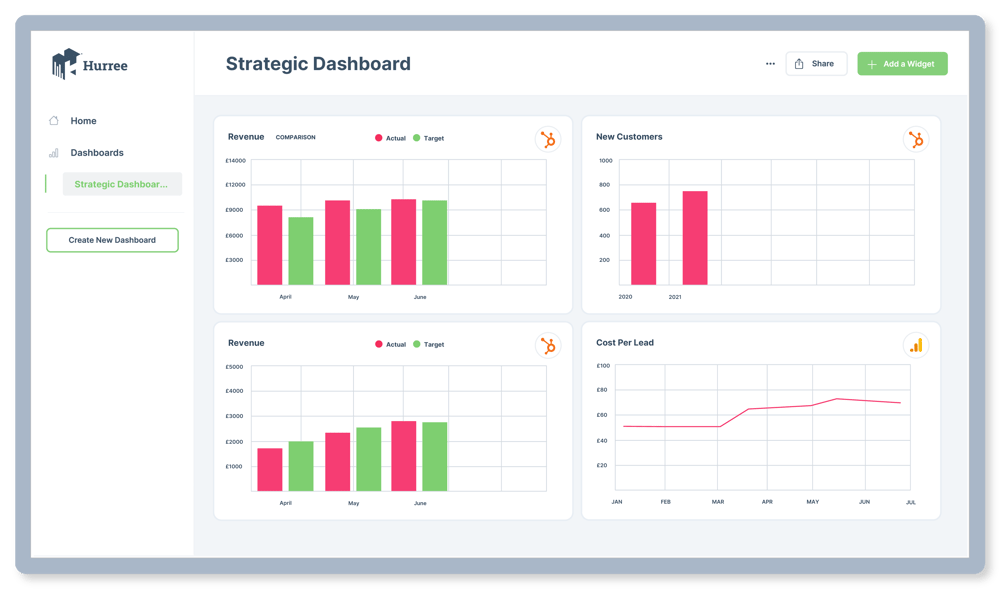
Not surprisingly, strategic dashboards are great tools for management teams. Think of data and KPIs that you would present at a board meeting - easy to see what’s going on but detailed enough that it provides context for decision making. A lot of what goes into a management dashboard will show current performance against targets or vs a previous period. Some good examples of what to include:
- Revenue: target vs actual
- Financial performance compared to previous year
- New customers compared to previous year
- New customers: target vs actual
- Revenue per customer: target vs actual
- Revenue per customer year on year
- CAC vs CLV
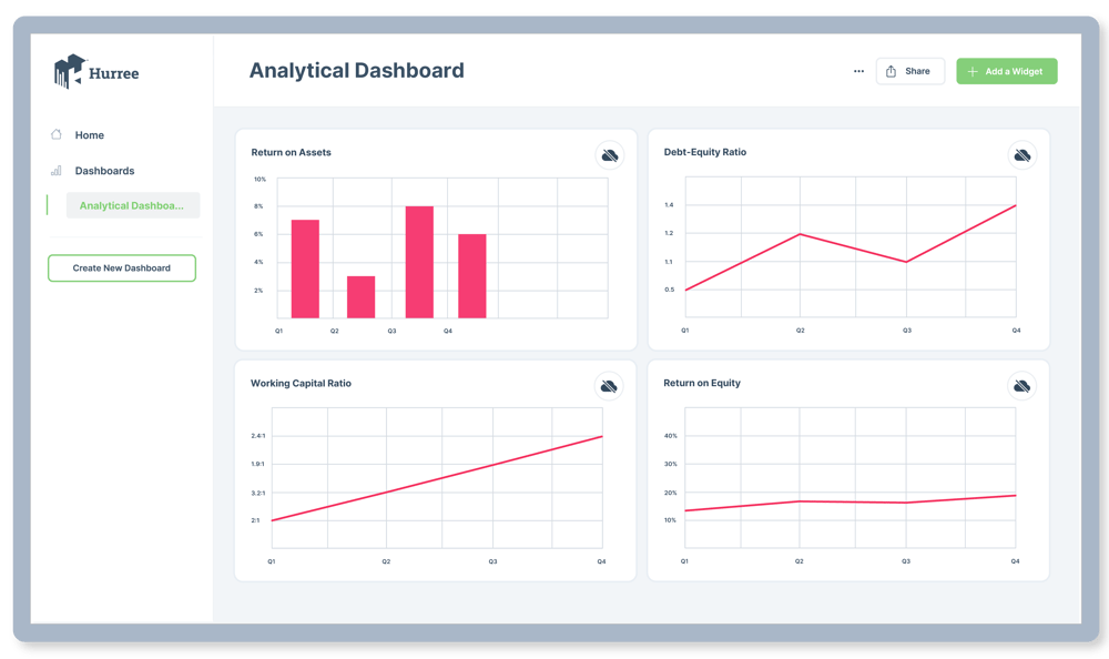
Analytical dashboards
As the name suggests, analytical dashboards are used to analyse large amounts of data. These work best when looking at historical information as a means of investigating trends, and consequently predicting outcomes. Analytical dashboards are a great tool to discover insights and actually establish the targets you’ll be tracking with other dashboards.
However, analytical dashboards can be very detailed and not as intuitive to use. They were developed by and for the use of data analysts, and include a large volume of data across multiple variables. In other words, the data displayed tends to be quite complex, but they are also quite customisable when used by the right teams. If you have the right skill level, analytical dashboards allow you to interact with data exploration and uncover fresh insights with filters, brushing, series selection, data drilling, and other features. They do this by incorporating advanced business intelligence features like drill-down and ad-hoc querying – allowing the user to explore more of the data and get different insights.
Not every business or team will need to use analytical dashboards, but they can be very useful in certain situations.
Example
Financial performance can be tracked and displayed well using the detailed nature of an analytical dashboard. The example below focuses on performance that can help senior management track spend and create specific operational processes to make decisions going forward. It includes metrics such as:
- Return on assets
- Working capital ratio
- Return on equity
- Debt-equity ratio
- Balance sheet
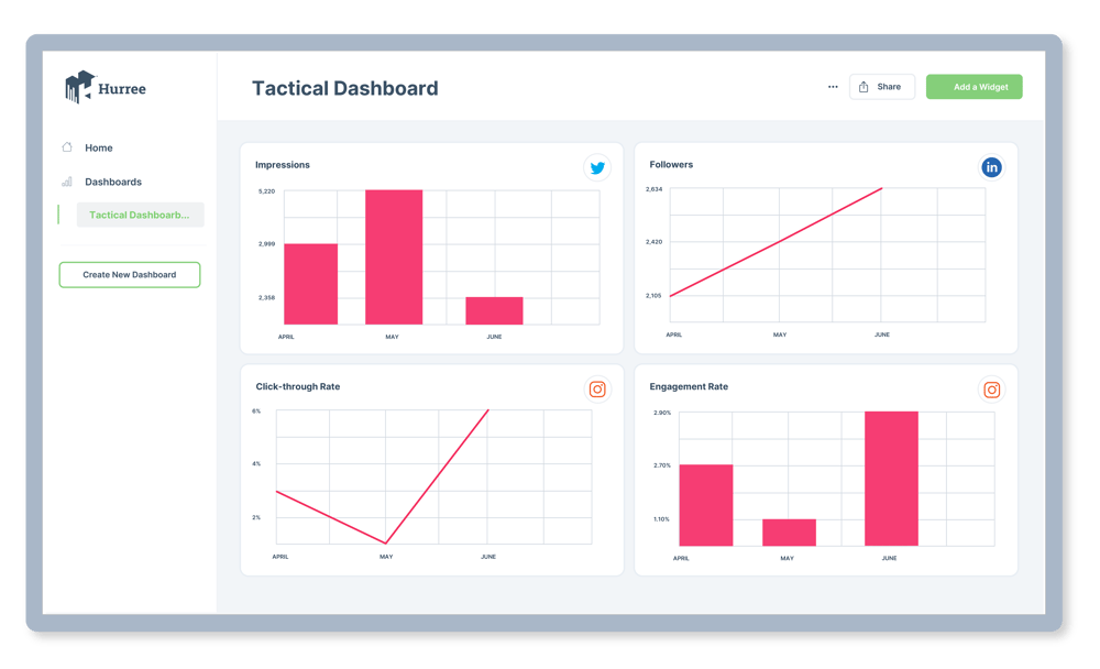
Tactical dashboards
Tactical dashboards fall somewhere between strategic and operational. They are used by line managers or team leaders to analyse and monitor processes, and like other dashboards, facilitate decision-making. What makes tactical dashboards different from others is that they capitalise on the interactive nature of dashboards, designed to be interactive in the way users interact with the data.
While strategic and operational dashboards operate to monitor processes and troubleshoot, tactical dashboards are meant for in-depth analysis, particularly in teams or companies where an analytical dashboard either isn’t possible or appropriate.
What this means is that tactical dashboards provide the users with the ability to filter data, segment information, and more, in a way that allows you to detect patterns and opportunities easily. Think of it as analysis over monitoring. You’d likely use tactical dashboards when setting out company-wide objectives and OKRs, or perhaps even looking at long-term planning.
Example
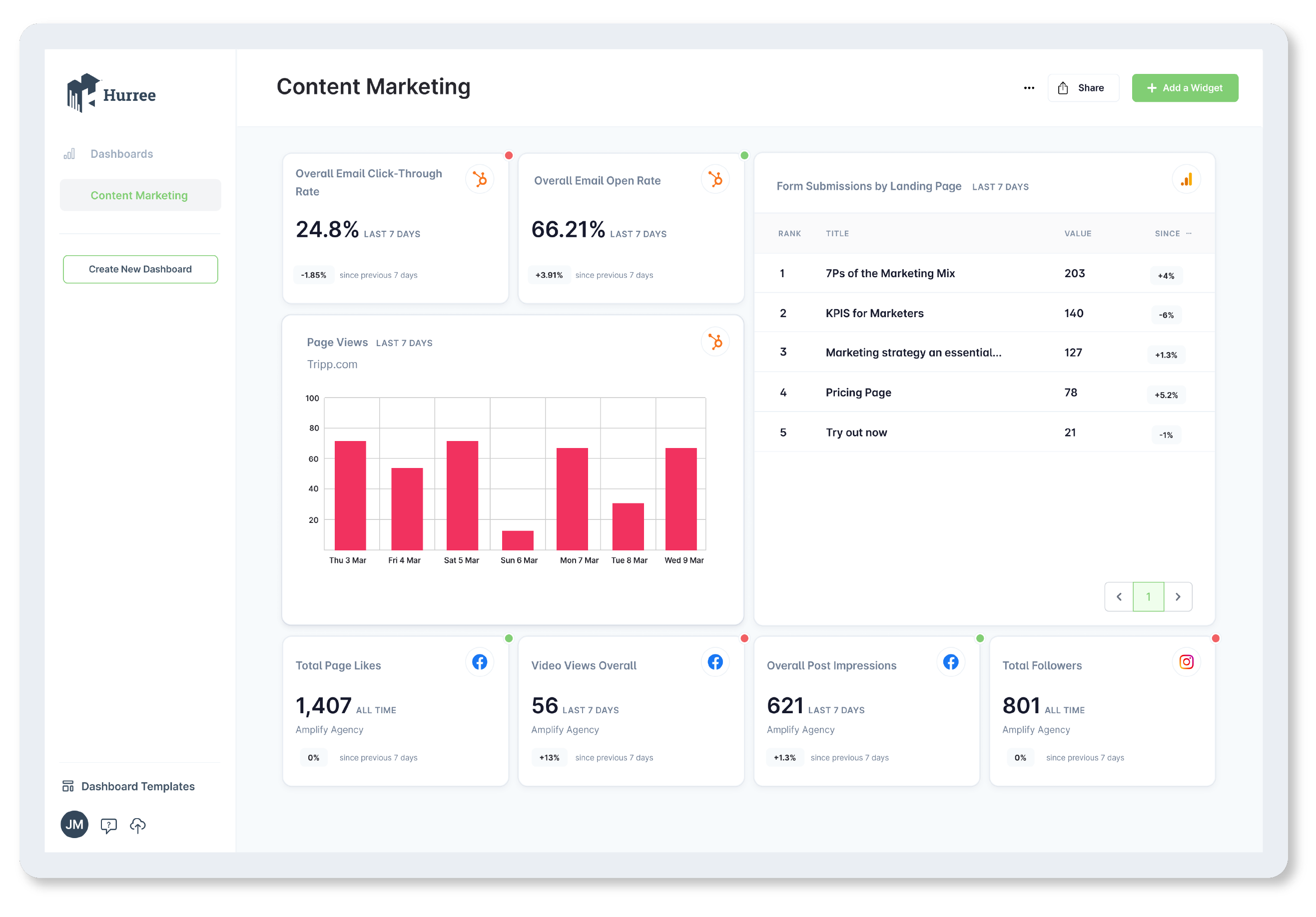
For marketers, a tactical dashboard is great for measuring the performance of things like social media campaigns. Set up properly, it allows you to drill down into the different channels, ensuring you have enough data to amend your strategy going forward. KPIs and metrics that you may track here would be:
- Followers
- Impressions
- Link clicks
- CTR
KPI measurements
Dashboards are not just about throwing together data, they should have a clear purpose behind them and provide a way to track progress, and KPI measurements are one of the best ways to do that. Effective dashboards will display KPI measurements in a way that provides meaningful insight and leads to real action.
You can even take this a step further. A great dashboard, as opposed to a good one, will not only show your KPI measurements, it will also show if you’re on track to hit your goals. Let’s use our marketing dashboard as an example, an effective dashboard would have a way of measuring KPIs like conversion rate, customer acquisition cost, etc. However, an even more effective dashboard would show your current performance against your target performance, so you can always see what you’re doing at-a-glance.
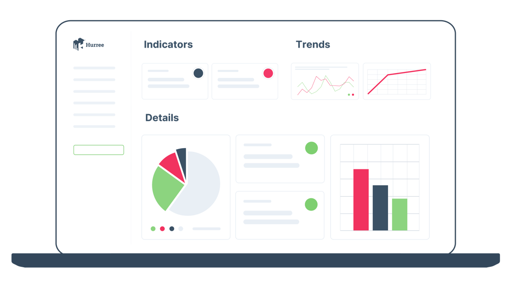
Data visualisation
Part of being able to track your KPIs on a dashboard is effective visualisation of your progress and data. Being able to see your key metrics and KPIs in a graphic way is one of the reasons dashboards exist. Without the visual representation, you’re really just putting numbers on a page.
Some of the elements you’ll want to make sure you have access to are:
Real-time data options
Not every dashboard you create will require real-time data, but having the option - or close to it (think of a few hours’ delay) - is an absolute must. This means your dashboards maintain relevance allowing you to make timely and accurate decisions. This is especially important for operational dashboards as they rely completely on making up-to-the minute decisions.
If you’re tracking call-centre performance using an operational dashboard and your data is lagging, you could end up in quite a difficult situation.
Let’s say, for example, your call volume is showing as low, but that data is actually from an hour earlier and you have since had a large increase in calls. If you’re using the older data, you may let some staff go home early or go on break, causing major issues for the team.
Sharing options
A dashboard isn’t effective if you have to physically present it to stakeholders anytime they want access to the data. That’s why having a number of sharing options is super important. You also don’t want to have to provide account login details to every person who may want to see your dashboard. This makes it hard to manage the quality of the data and, let’s be honest, there are a large number of stakeholders out there who aren’t exactly tech savvy. So what options should you be looking for?
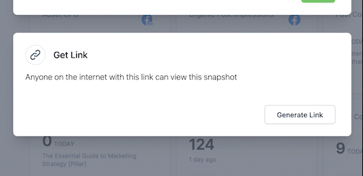
- Email: being able to send a snapshot or link to the dashboard via email means you can share your dashboard with anyone, regardless of their technological know-how.
- Link sharing: similar to the email options, being able to share a link that provides a viewer with a scaled down version or snapshot of the dashboard means you can send it via any of your messaging tools (i.e. Slack, Teams, Google Hangouts).
- Reduced user permissions: for people who maybe want to be able to look at different filters or dig into the data, having the options of reduced permissions or ‘Guest’ logins means you can protect the integrity of the dashboard, while still allowing them to get what they need from it.
The basics of dashboard design
Now that you know what goes into a good dashboard, the next step is building a dashboard that looks the part. How do you go about doing that? Well, it will depend on your specific dashboard, but it’s important to keep in mind these basic tips.
Glorious purpose
By the time you’re designing your dashboard, you should already know what and who it’s for. This information isn’t just useful in deciding what information to include, it’s also really important for how you include that information.
Use hierarchies to show priority
One really great way to make your dashboard easily readable is to structure data in a way that makes it clear what’s important. In other words, use hierarchies to place the most important information where people are most likely to see it.
One model of doing this is using an inverted pyramid structure. With this type of layout you would have important details at the top of the dashboard, trends in the middle, and then the more granular details at the bottom (if at all).
Follow the 5-second rule
Nothing to do with food, this rule posits that you should be able to understand all of the important data in 5 seconds or less. While it’s not a hard and fast rule, you should aim to make sure your data is laid out in a way that all of your FAQs can be answered at a glance. The whole point of a dashboard is to distil large swathes of data into a digestible form, and no one wants to be digesting for more than a few minutes.
This is especially true when you’re sharing your dashboards at an executive or c-suite level. Your CEO doesn’t want to spend an hour of their time deciphering the data, so ensuring your dashboard is built to be read quickly will make everyone happy.
Less is more
It’s a cliche for a reason. Too much information or too many visuals not only make a dashboard feel cluttered, but it can actually drown the important information you’re trying to share.
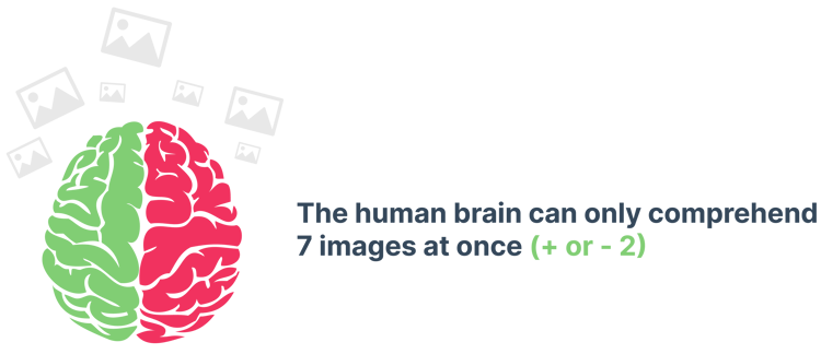
Source: National Library of Medicine
There are no hard and fast numbers, but keeping visualisations on any one dashboard below 10 means there is room for it to be seen, and it won’t be overshadowed.
Some tips to keep in mind:
- Round your numbers. No one needs to see that your conversion rate is 23.55672%
- Keep your visualisations to 10 or below. Anything more should be split into 2 dashboards.
- Use size and position to your advantage. They can show hierarchies and groupings without having to add more text to the dashboard.
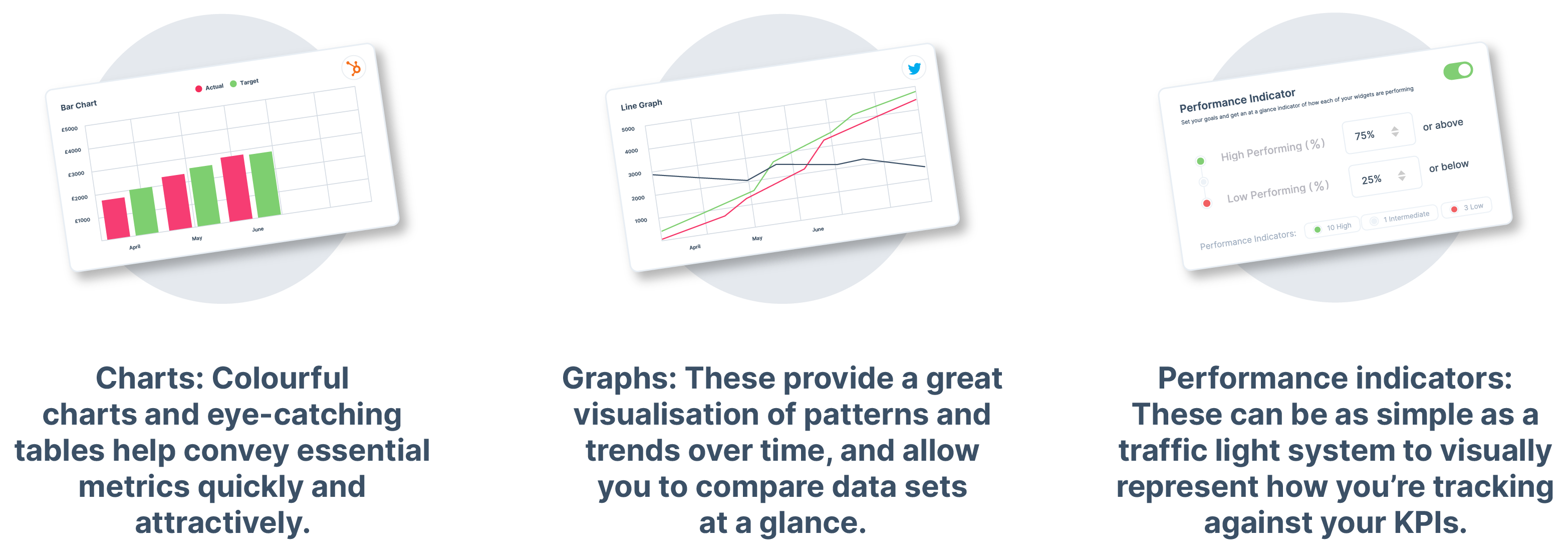
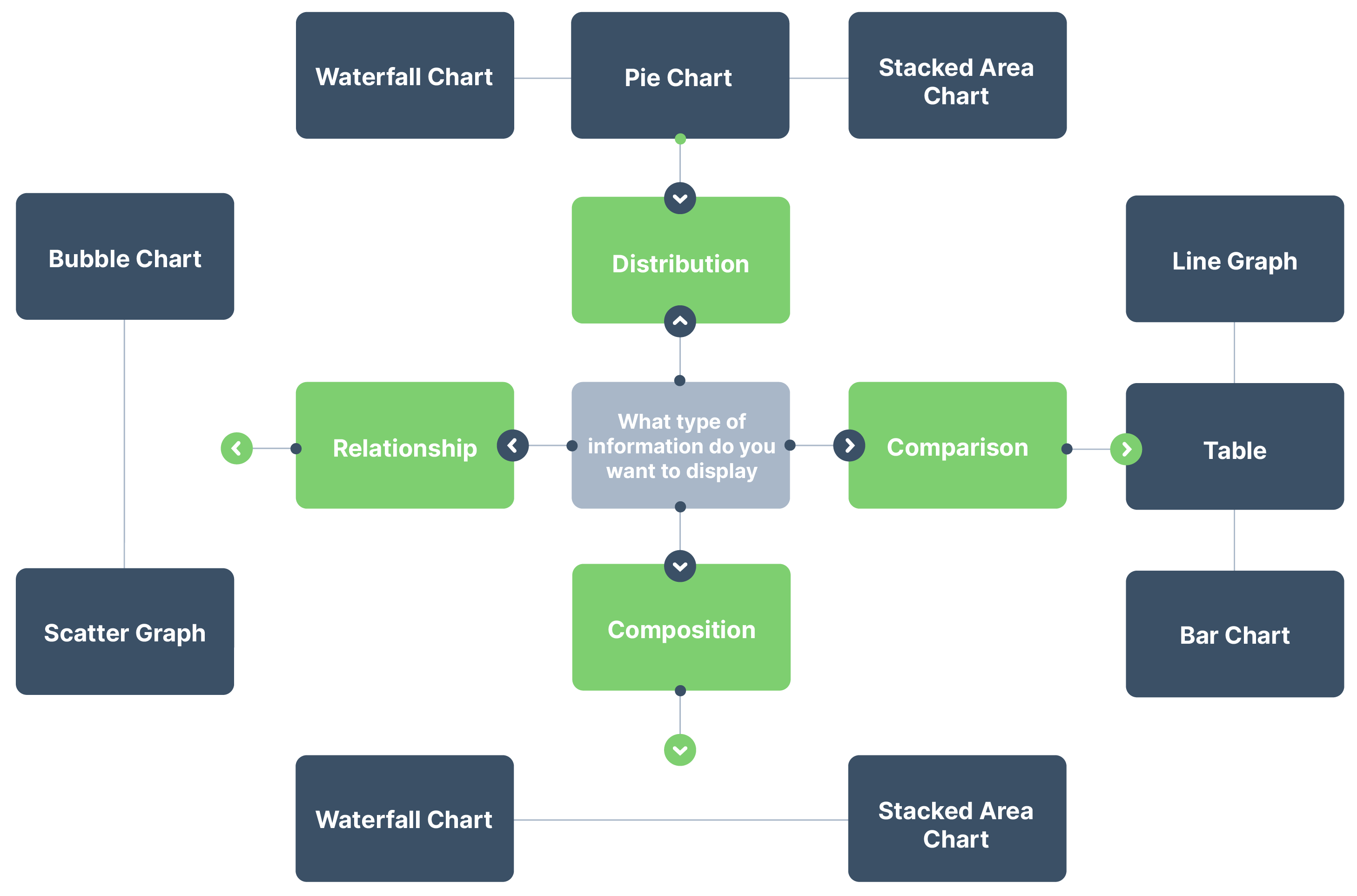
Choose the right visualisations
It’s not just about the number of visualisations but making sure you choose the right type. Dashboard design is all about efficiency, but that doesn’t mean variety is not also appreciated.
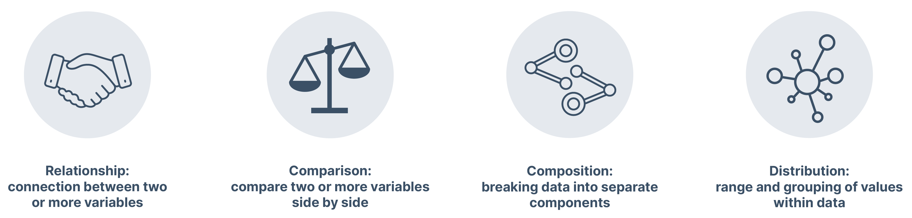
When choosing your visualisations, you want to consider the type of information you’re trying to show. With each different type of relationship or correlation, a different visualisation will likely be appropriate.
For example, if you’re trying to show a comparison between multiple elements, a pie chart probably isn’t the best choice.
Don’t forget the context
A number on a dashboard only means as much as the context around it. Yes, you got 27 MQLs this week, but what does that mean? Is that lower than last week? Did those leads go on to convert at all?
So how do you provide context on a dashboard? It’s very important to tell a story, and there are a few ways to do that. Showing the complete cycle or ‘end’ point of a variable helps. Using our example above, you could contextualise that by showing the performance of the entire funnel.
Just as important as choosing the right information, your dashboard will only be effective if you have the right software. There are a host of different options out there, each with their own strengths and weaknesses, but there will be key functionality to look out for.
Data sources and integrations
This is the most basic but most important element of any good dashboard software - the ability to pull information from multiple data sources. Even more important is that it can integrate and pull data from the tools already in your tech stack.
A good dashboard tool will have connectors to data sources like Facebook, Google Analytics, or HubSpot, for example. While a lot of tools will offer plug and play integrations , there are a lot of dashboards out there that will work with you to set-up bespoke integrations based on your specific needs; however, this level of customisation often comes at a much higher cost.
How often data updates
Although basic, this functionality is super important, having a direct impact on the type of dashboards you want to create. Operational dashboards specifically require near real-time data to function properly. When you’re looking for dashboard software, you need to take this into account. Having up-to-date, relevant data is a key requirement in today’s fast-paced world, where information from yesterday will not be enough for today.
Collaboration and sharing options
By their very definition, dashboards are about collaboration, so any good dashboard software will have multiple options for sharing and collaborating. In terms of sharing, think about the following:
- Does the tool offer the ability for users to log in themselves?
- Does it provide different levels of access?
- Can you share a snapshot of the data easily with less tech-savvy stakeholders?
Ideally, your dashboard software will have multiple options so that you have the flexibility to share your data however your stakeholders prefer.
User experience
All the bells and whistles of your dashboard software won’t mean much if it’s difficult to use. Not only should your dashboards be easy for stakeholders to navigate, they should also be easy to build and navigate. No one wants to have to employ a developer or coding expert to set up and update your dashboard. Look for a dashboard software that seamlessly integrates with your existing tools and platforms and has quick, easy-to-add widgets.
An important feature to consider is the ability to show only the data that you choose, as one size doesn’t always fit all. What metrics are relevant for one business may not be relevant to another so you need a dashboard that will allow you to customise the widgets that you add.
Visualisation options
We’ve talked about how important having the right type of visualisation is, and that’s why you should ensure any dashboard tool you use has the right chart, graph, table, etc. for the data you want to display.
Source: Shift

Ashleigh McCabe
Content Marketing Specialist
.jpg?width=1000&height=1000&name=CYMERA_20210218_133809%20(1).jpg)
Melissa Hugel
Content Marketing Manager

Jonny Robinson
Graphic Designer

Marketing Dashboard Examples: 7 Templates You Can Copy

Agency Guide: How to Automate Marketing Reports
